こんにちは!
Shumiデザインのしゅうへいです。
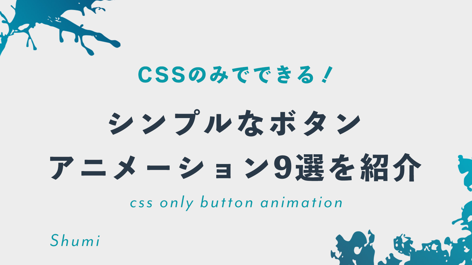
今回は、CSSオンリーで作れるhoverボタンアニメーションの紹介をします。
ボタン探してるのだけど、CodePenでてくるけど、あれ正直コピペしづらいし、Js入って何が何だかわからないときってあるよねぇ。。
と思っているあなた。そんなことだろうと思って、今回は
実演はCodePenで見せつつ、下にコピペしやすいように置いておきました。
なにそれたすかるーーーー!!
ほんとどれもシンプルなボタンです。
ですが、かなり実案件でも使用することができます。
たくさんボタンアニメーションはありますが、その中でも9個に絞りました。
よかったら、読んでブックマークなどしていただけると嬉しいです。
① 下から上へ。
See the Pen simple_button01 by shuhei (@fujimura_shuhei308) on CodePen.
<button class="button2">
    詳しくをみる
</button>
.button2 {
display: inline-block;
transition: all 0.2s ease-in;
position: relative;
overflow: hidden;
z-index: 1;
color: #090909;
padding: 0.7em 1.7em;
font-size: 18px;
border-radius: 0.5em;
background: #e8e8e8;
border: 1px solid #e8e8e8;
box-shadow: 6px 6px 12px #c5c5c5,
-6px -6px 12px #ffffff;
}
.button2:active {
color: #666;
box-shadow: inset 4px 4px 12px #c5c5c5,
inset -4px -4px 12px #ffffff;
}
.button2:before {
content: "";
position: absolute;
left: 50%;
transform: translateX(-50%) scaleY(1) scaleX(1.25);
top: 100%;
width: 140%;
height: 180%;
background-color: rgba(0, 0, 0, 0.05);
border-radius: 50%;
display: block;
transition: all 0.5s 0.1s cubic-bezier(0.55, 0, 0.1, 1);
z-index: -1;
}
.button2:after {
content: "";
position: absolute;
left: 55%;
transform: translateX(-50%) scaleY(1) scaleX(1.45);
top: 180%;
width: 160%;
height: 190%;
background-color: #009087;
border-radius: 50%;
display: block;
transition: all 0.5s 0.1s cubic-bezier(0.55, 0, 0.1, 1);
z-index: -1;
}
.button2:hover {
color: #ffffff;
border: 1px solid #009087;
}
.button2:hover:before {
top: -35%;
background-color: #009087;
transform: translateX(-50%) scaleY(1.3) scaleX(0.8);
}
.button2:hover:after {
top: -45%;
background-color: #009087;
transform: translateX(-50%) scaleY(1.3) scaleX(0.8);
}
② 下線と矢印の横移動
See the Pen Untitled by shuhei (@fujimura_shuhei308) on CodePen.
<button class="cta">
    <span class="hover-underline-animation"> 詳しくみる </span>
    <svg viewBox="0 0 46 16" height="10" width="30" xmlns="<http://www.w3.org/2000/svg>" id="arrow-horizontal">
        <path transform="translate(30)" d="M8,0,6.545,1.455l5.506,5.506H-30V9.039H12.052L6.545,14.545,8,16l8-8Z" data-name="Path 10" id="Path_10"></path>
    </svg>
</button>
.cta {
  border: none;
  background: none;
}

.cta span {
  padding-bottom: 7px;
  letter-spacing: 4px;
  font-size: 14px;
  padding-right: 15px;
  text-transform: uppercase;
}

.cta svg {
  transform: translateX(-8px);
  transition: all 0.3s ease;
}

.cta:hover svg {
  transform: translateX(0);
}

.cta:active svg {
  transform: scale(0.9);
}

.hover-underline-animation {
  position: relative;
  color: black;
  padding-bottom: 20px;
}

.hover-underline-animation:after {
  content: "";
  position: absolute;
  width: 100%;
  transform: scaleX(0);
  height: 2px;
  bottom: 0;
  left: 0;
  background-color: #000000;
  transform-origin: bottom right;
  transition: transform 0.25s ease-out;
}

.cta:hover .hover-underline-animation:after {
  transform: scaleX(1);
  transform-origin: bottom left;
}
③ 左から右に行くボタン
See the Pen Untitled by shuhei (@fujimura_shuhei308) on CodePen.
<button>
  <span>詳しくみる</span>
</button>
button {
 position: relative;
 display: flex;
 justify-content: center;
 align-items: center;
 border-radius: 5px;
 background: #183153;
 font-family: "Montserrat", sans-serif;
 box-shadow: 0px 6px 24px 0px rgba(0, 0, 0, 0.2);
 overflow: hidden;
 border: none;
}

button:after {
 content: " ";
 width: 0%;
 height: 100%;
 background: #FFD401;
 position: absolute;
 transition: all 0.4s ease-in-out;
 right: 0;
}

button:hover::after {
 right: auto;
 left: 0;
 width: 100%;
}

button span {
 text-align: center;
 text-decoration: none;
 width: 100%;
 padding: 18px 25px;
 color: #fff;
 font-size: 1.125em;
 font-weight: 700;
 letter-spacing: 0.3em;
 z-index: 20;
 transition: all 0.3s ease-in-out;
}

button:hover span {
 color: #183153;
 animation: scaleUp 0.3s ease-in-out;
}

@keyframes scaleUp {
 0% {
  transform: scale(1);
 }

 50% {
  transform: scale(0.95);
 }

 100% {
  transform: scale(1);
 }
}
④ 矢印と色が若干変わる
See the Pen Untitled by shuhei (@fujimura_shuhei308) on CodePen.
<button>
    <span>Continue</span>
    <svg width="34" height="34" viewBox="0 0 74 74" fill="none" xmlns="<http://www.w3.org/2000/svg>">
        <circle cx="37" cy="37" r="35.5" stroke="black" stroke-width="3"></circle>
        <path d="M25 35.5C24.1716 35.5 23.5 36.1716 23.5 37C23.5 37.8284 24.1716 38.5 25 38.5V35.5ZM49.0607 38.0607C49.6464 37.4749 49.6464 36.5251 49.0607 35.9393L39.5147 26.3934C38.9289 25.8076 37.9792 25.8076 37.3934 26.3934C36.8076 26.9792 36.8076 27.9289 37.3934 28.5147L45.8787 37L37.3934 45.4853C36.8076 46.0711 36.8076 47.0208 37.3934 47.6066C37.9792 48.1924 38.9289 48.1924 39.5147 47.6066L49.0607 38.0607ZM25 38.5L48 38.5V35.5L25 35.5V38.5Z" fill="black"></path>
    </svg>
</button>
button {
  cursor: pointer;
  font-weight: 700;
  font-family: Helvetica,"sans-serif";
  transition: all .2s;
  padding: 10px 20px;
  border-radius: 100px;
  background: #cfef00;
  border: 1px solid transparent;
  display: flex;
  align-items: center;
  font-size: 15px;
}

button:hover {
  background: #c4e201;
}

button > svg {
  width: 34px;
  margin-left: 10px;
  transition: transform .3s ease-in-out;
}

button:hover svg {
  transform: translateX(5px);
}

button:active {
  transform: scale(0.95);
}
⑤ めちゃおしゃれなボタン
See the Pen Untitled by shuhei (@fujimura_shuhei308) on CodePen.
<a class="fancy" href="#">
  <span class="top-key"></span>
  <span class="text">詳しくみる</span>
  <span class="bottom-key-1"></span>
  <span class="bottom-key-2"></span>
</a>
.fancy {
 background-color: transparent;
 border: 2px solid #000;
 border-radius: 0;
 box-sizing: border-box;
 color: #fff;
 cursor: pointer;
 display: inline-block;
 float: right;
 font-weight: 700;
 letter-spacing: 0.05em;
 margin: 0;
 outline: none;
 overflow: visible;
 padding: 1.25em 2em;
 position: relative;
 text-align: center;
 text-decoration: none;
 text-transform: none;
 transition: all 0.3s ease-in-out;
 user-select: none;
 font-size: 13px;
}

.fancy::before {
 content: " ";
 width: 1.5625rem;
 height: 2px;
 background: black;
 top: 50%;
 left: 1.5em;
 position: absolute;
 transform: translateY(-50%);
 transform-origin: center;
 transition: background 0.3s linear, width 0.3s linear;
}

.fancy .text {
 font-size: 1.125em;
 line-height: 1.33333em;
 padding-left: 2em;
 display: block;
 text-align: left;
 transition: all 0.3s ease-in-out;
 text-transform: uppercase;
 text-decoration: none;
 color: black;
}

.fancy .top-key {
 height: 2px;
 width: 1.5625rem;
 top: -2px;
 left: 0.625rem;
 position: absolute;
 background: #e8e8e8;
 transition: width 0.5s ease-out, left 0.3s ease-out;
}

.fancy .bottom-key-1 {
 height: 2px;
 width: 1.5625rem;
 right: 1.875rem;
 bottom: -2px;
 position: absolute;
 background: #e8e8e8;
 transition: width 0.5s ease-out, right 0.3s ease-out;
}

.fancy .bottom-key-2 {
 height: 2px;
 width: 0.625rem;
 right: 0.625rem;
 bottom: -2px;
 position: absolute;
 background: #e8e8e8;
 transition: width 0.5s ease-out, right 0.3s ease-out;
}

.fancy:hover {
 color: white;
 background: black;
}

.fancy:hover::before {
 width: 0.9375rem;
 background: white;
}

.fancy:hover .text {
 color: white;
 padding-left: 1.5em;
}

.fancy:hover .top-key {
 left: -2px;
 width: 0px;
}

.fancy:hover .bottom-key-1,
 .fancy:hover .bottom-key-2 {
 right: 0;
 width: 0;
}
⑥ 上に弾むボタン
See the Pen Untitled by shuhei (@fujimura_shuhei308) on CodePen.
<button>詳しくみる
</button>
button {
  padding: 1.3em 3em;
  font-size: 12px;
  text-transform: uppercase;
  letter-spacing: 2.5px;
  font-weight: 500;
  color: #000;
  background-color: #fff;
  border: none;
  border-radius: 45px;
  box-shadow: 0px 8px 15px rgba(0, 0, 0, 0.1);
  transition: all 0.3s ease 0s;
  cursor: pointer;
  outline: none;
}

button:hover {
  background-color: #23c483;
  box-shadow: 0px 15px 20px rgba(46, 229, 157, 0.4);
  color: #fff;
  transform: translateY(-7px);
}

button:active {
  transform: translateY(-1px);
}
⑦ 文字とともに、色が上がってくる
See the Pen Untitled by shuhei (@fujimura_shuhei308) on CodePen.
<button><span class="text">事業内容</span><span>詳しくみる</span></button>button {
position: relative;
overflow: hidden;
border: 1px solid #18181a;
color: #18181a;
display: inline-block;
font-size: 15px;
line-height: 15px;
padding: 18px 18px 17px;
text-decoration: none;
cursor: pointer;
background: #fff;
user-select: none;
-webkit-user-select: none;
touch-action: manipulation;
}
button span:first-child {
position: relative;
transition: color 600ms cubic-bezier(0.48, 0, 0.12, 1);
z-index: 10;
}
button span:last-child {
color: white;
display: block;
position: absolute;
bottom: 0;
transition: all 500ms cubic-bezier(0.48, 0, 0.12, 1);
z-index: 100;
opacity: 0;
top: 50%;
left: 50%;
transform: translateY(225%) translateX(-50%);
height: 14px;
line-height: 13px;
}
button:after {
content: "";
position: absolute;
bottom: -50%;
left: 0;
width: 100%;
height: 100%;
background-color: black;
transform-origin: bottom center;
transition: transform 600ms cubic-bezier(0.48, 0, 0.12, 1);
transform: skewY(9.3deg) scaleY(0);
z-index: 50;
}
button:hover:after {
transform-origin: bottom center;
transform: skewY(9.3deg) scaleY(2);
}
button:hover span:last-child {
transform: translateX(-50%) translateY(-50%);
opacity: 1;
transition: all 900ms cubic-bezier(0.48, 0, 0.12, 1);
}
⑧ 矢印が動いて、ボタンになる
See the Pen Untitled by shuhei (@fujimura_shuhei308) on CodePen.
<button class="learn-more">
  <span class="circle" aria-hidden="true">
  <span class="icon arrow"></span>
  </span>
  <span class="button-text">詳しくみる</span>
</button>
button {
position: relative;
display: inline-block;
cursor: pointer;
outline: none;
border: 0;
vertical-align: middle;
text-decoration: none;
background: transparent;
padding: 0;
font-size: inherit;
font-family: inherit;
}
button.learn-more {
width: 12rem;
height: auto;
}
button.learn-more .circle {
transition: all 0.45s cubic-bezier(0.65, 0, 0.076, 1);
position: relative;
display: block;
margin: 0;
width: 3rem;
height: 3rem;
background: #282936;
border-radius: 1.625rem;
}
button.learn-more .circle .icon {
transition: all 0.45s cubic-bezier(0.65, 0, 0.076, 1);
position: absolute;
top: 0;
bottom: 0;
margin: auto;
background: #fff;
}
button.learn-more .circle .icon.arrow {
transition: all 0.45s cubic-bezier(0.65, 0, 0.076, 1);
left: 0.625rem;
width: 1.125rem;
height: 0.125rem;
background: none;
}
button.learn-more .circle .icon.arrow::before {
position: absolute;
content: "";
top: -0.29rem;
right: 0.0625rem;
width: 0.625rem;
height: 0.625rem;
border-top: 0.125rem solid #fff;
border-right: 0.125rem solid #fff;
transform: rotate(45deg);
}
button.learn-more .button-text {
transition: all 0.45s cubic-bezier(0.65, 0, 0.076, 1);
position: absolute;
top: 0;
left: 0;
right: 0;
bottom: 0;
padding: 0.75rem 0;
margin: 0 0 0 1.85rem;
color: #282936;
font-weight: 700;
line-height: 1.6;
text-align: center;
text-transform: uppercase;
}
button:hover .circle {
width: 100%;
}
button:hover .circle .icon.arrow {
background: #fff;
transform: translate(1rem, 0);
}
button:hover .button-text {
color: #fff;
}
⑨ 左下から流れてくる
See the Pen Untitled by shuhei (@fujimura_shuhei308) on CodePen.
<button type="submit" class="button">
  <span>詳しくみる</span>
</button>
button {
width: 100px;
height: 50px;
border-radius: 30em;
font-size: 15px;
font-family: inherit;
border: none;
position: relative;
overflow: hidden;
z-index: 1;
box-shadow: 6px 6px 12px #c5c5c5,
-6px -6px 12px #ffffff;
}
button:hover {
color: #ffffff;
transform: scale(1.1);
outline: 2px solid #70bdca;
box-shadow: 4px 5px 17px -4px #268391;
}
button::before {
content: "";
position: absolute;
left: -50px;
top: 0;
width: 0;
height: 100%;
background-color: #2c9caf;
transform: skewX(45deg);
z-index: -1;
transition: width 1000ms;
}
button:hover::before {
width: 250%;
}